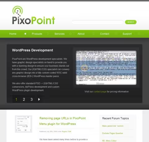
PixoPoint gone
Published September 15th, 2012 under General
Regular site visitors may have noticed a rather major change in this site today, the URL changed! It was previously hosted at geek.hellyer.kiwi but today moved to it’s new home at geek.hellyer.kiwi. Probably no one else will care, but this is a major move for me as I’d worked very hard on building a brand name and so I thought I’d write a post about it.

My old logo. I’ll miss it, but I’ve been informed by others that logos don’t gel so well with personal branding.
The reason for the big move was simply that the original PixoPoint brand served no real purpose any more. It originally started as a launching pad for branding a series of new products and services which I envisaged being more marketable with a brand identity rather than a personal identity. That goal of the site disappeared around two years ago, so continuing it seemed silly. I’m now pooling everything together and putting it under one roof on RyanHellyer.net domain. My personal posts, photos etc. will be hosted at the root of the domain, random extra stuff (most likely boring things) will be posted at random.hellyer.kiwi and all my geeky techy things will be posted right here on geek.hellyer.kiwi. By keeping them all segmented, I’m hoping to keep it obvious where to go to find different types of content.
New features of the site
If minimalism counts as a feature, then that would be the most important new feature! I’ve removed a bunch of dead old posts, fixed many SEO issues, blitzed the redundant unused forums (which are archived to forum.hellyer.kiwi) and simplified the home page and menu system. Gone is the dropdown menu, replaced with a simple set of links to the most important things and gone is the rather gawdy, albeit surprisingly popular slider on the home page (I received lots of requests for the code). Gone is the old logo and in is a mugshot of yours truly (apparently people like to know what I look like).
The performance of the site has also just gone through the roof, which you can read about on my last blog post about site performance. The old site used to bog down extraordinarily badly whenever more than a handful of people attempted to visit it at the same time.
The only real addition to the site is the plugins page. I still have some work to do on this, but I’m really happy with it so far. Previously, even I couldn’t find which plugins I’d created, which were up to date, which were supported or even remember where they were or what they were called. I now have a very convenient list in the plugins page listed in the main menu.
New site design
The new site design is “almost” identical to the old one which was designed by the super talented Tung Do who kindly did the design work for free back in the day. The lovely Tammie Lister provided input a few weeks back on how I should rejig it for my new personal branding and Shay Ponsonby provided a mockup based on Tammie’s concept. The design is not completed yet, I still need to do some more things with the header and it’s not as mobile friendly as I’d like right now, but I figured it’s in good enough shape for launch 🙂

