Small Potato redesign
Published November 2nd, 2009 under General
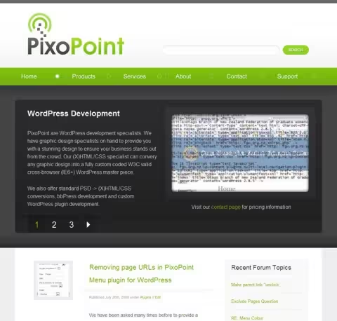
 Some you may have noticed the drastically different look we have around here. This has been thanks to the brilliant work of Tung do (aka Small Potato). Tung has recently come back from an extended break from web design and offered to redesign PixoPoint.com. We were stoked when he sent us two PSD’s with the design you see here now. After some quick coding we turned them into a new WordPress theme and the result is before you right now (unless you are reading this via RSS).
If you would like a custom WordPress theme designed by Tung Do and coded here at PixoPoint, please get in touch via our contact form for more information.


Kate Mag says:
It is a beautiful design. Congrats to new redesign.
November 9, 2009 at 11:59 am # //
Jennifer Precious Finch says:
Ryan and Tung,
Gratz on the new design! Much easier on the eyes LOL. You two make a great team. I am looking forward to seeing what you both have up your sleeves for the future.
-JPF
November 18, 2009 at 2:01 pm # //
Ryan says:
Thanks for the kind words Kate and Jennifer 🙂
November 22, 2009 at 8:27 pm # //
WpExplorer says:
Everything looks amazing. The only thing you may want to look at is that the input boxes and titles are not aligned properly (IE 8.) It made it confusing when submitting this comment.
Besides that the colors and everything are amazing. I love the navigation design, very well done. Kudos to SP.
December 25, 2009 at 4:18 am # //
Ryan says:
Hi, thanks for the compliments and tip about the comments in IE8.
Small Potato had mentioned the comments section looked messed up, but I assumed he was referring to the graphics for new paragraphs looking a little silly so I hadn’t bothered fixing it yet! I probably checked everything in IE8 BUT the comments section when coding it.
December 26, 2009 at 2:06 am # //
Muzika says:
It is a beautiful design. Very niceee … 🙂
January 1, 2010 at 6:22 am # //
Ryan says:
Thanks Muzika 🙂
January 1, 2010 at 3:12 pm # //